Blog

Not redundant

I show these photos so you can see how the flesh application works. The grasialle under everything gives the deeper color to the flesh and the light falls on the protruding surface as shown by the application of white and naples yellow. Of course, the more layers, the more supple looking the skin. This is harder to achieve in the shadows sometimes. When we work with a challenging subject, the results are more rewarding. I will be teaching a portrait class,(sorry it is full) so I will be very busy but I will try to post something from this.

Diana

Standard
Blog

I’m usually not in a hurry

Actually I refined my methods to fit into my possibilities that are always modified by pain, appointments and the number of pieces I am working on at one time. This image is, of course, showing flesh tone, applied and then carefully smoothed into the weave of the canvas where needed. Some artists apply a lot more paint, which I do toward the end. I find that my flesh tones look more supple and lifelike if I keep them thin as much as possible. At the moment I have a pending commission, this subject with the three figures, a portrait class, a still life and two unfinished paintings that I sat aside several years ago. For now, have a great day painting. Diana

Standard
Blog

Layer after layer.

I have a lot going on. i am getting ready for portrait class that is coming up fast. i will post other images after that starts. I don’t want to work on my painting until I can demonstrate for the students. In this image, I have applied a thin, transparent flesh tone to which I apply a modifying darker flesh where needed and then I sculpt the entire flesh area with titanium and flake white, full strength but applied in varying degrees of thickness to be bright or less so. That is all for now, Diana

Standard
Blog

Portrait class

I have been asked repeatedly to do a portrait class. i thought last year at this time that i would do it but Covid and other things just did not let it happen. so, I’m giving it a try and the class is full already. everyone will bring their own photo references. The photo i feature on this post shows my two great grandsons along with the grayscale image graphed in one inch squares. then i cut paper the size of the canvas and begin by drawing the first graph lines in the middle, always start in the middle. i have calculated that my graph must now have squares of one and a half inches in order to make the image fit the area of canvas correctly. Then i use the proportional dividers you see here to mark the positioning of the features. it can be done freehand but i dont have time for correcting mistakes so i begin with this tool. then i draw the image lines onto the graphed paper using the squares to get everything correct. making a perfect drawing at this point is not as important as having the measurements right. i will teach my process, my method and also advise my students on how to handle the oil paints to achieve the skin tones and texture quality that give my work its special wow factor. please excuse the typing errors in this post. for some reason the ipad has decided not to punctuate or capitalize. first it does, then it doesnt. i wish it would be consistent! sorry guys. Happy painting. And for those who are now students, you can use these posts to help you get an idea of how things will be done in class. see you then. Diana

Standard
Blog

The Illusion

My portraits are recognized and remembered for a couple of reasons. one of these is the suppleness and believability of skin depth and texture. it is important to get references with subtle shadows. Even if you have these in your references and even if you paint them solidly into your grasaille or underpainting, the difficult part is understanding how to finesse the light and dark to enhance the value and increase the three dimensionality of the flesh. I tell my students to remember that shadowed flesh must still have skin, I have heard other artists teach not to add white into the shadows. Practice seeing and applying transparent amounts of skin over the shadows, especially on babies and elderly subjects. Look carefully at the shadowed areas where I have laid in the skin. Later observe how obscure but realistic it looks. Keep in mind the many layers it takes to achieve this look. Enjoy, Diana

Standard
Blog

Moving along

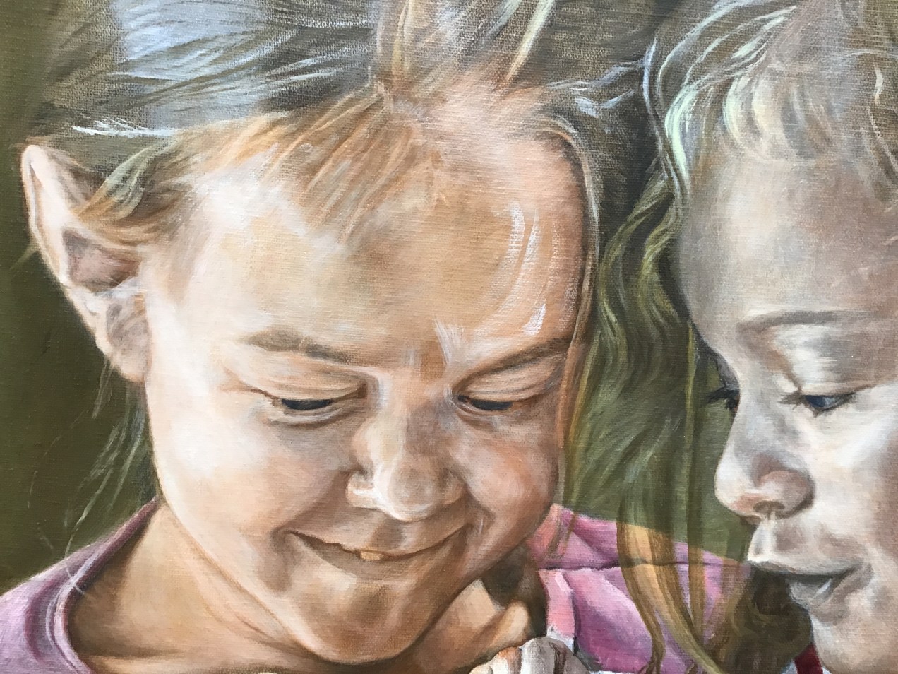
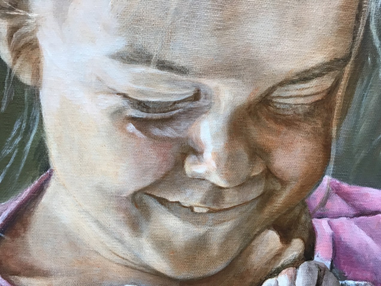
Strange day. Reminiscent of the flood of 77. Hurricane rain, dams overflowing and reports of dams breaking. Here beside the Conemaugh River we have frequent floods in certain places but since our area is hilly, to say the least, most places just get runoff in their basements. If the River is high enough to flood, you know there is a lot of water. Today, the painting I did was interrupted often by calls asking about our safety. I have such a desire to paint, but never seem to get much done at one time. This is the main reason I use the methods I do in order to make the most of short bursts of energy or short amounts of time available. My grasaille is almost complete. I used a flesh tone to deepen the areas in shadow and to make small corrections on the features. Beginning artists in realism don’t seem to see all the detail that will eventually bring their painting to that ‘wow’ place. And it is a factor of seeing, rather, noticing. We must learn to look into the dark spaces, or even into the light to see things that will catch the viewers attention. One thing about painting in tiny bits like this, it is truly like a puzzle; all of a sudden the final piece goes in and it’s done. HalleluYah!

Standard