

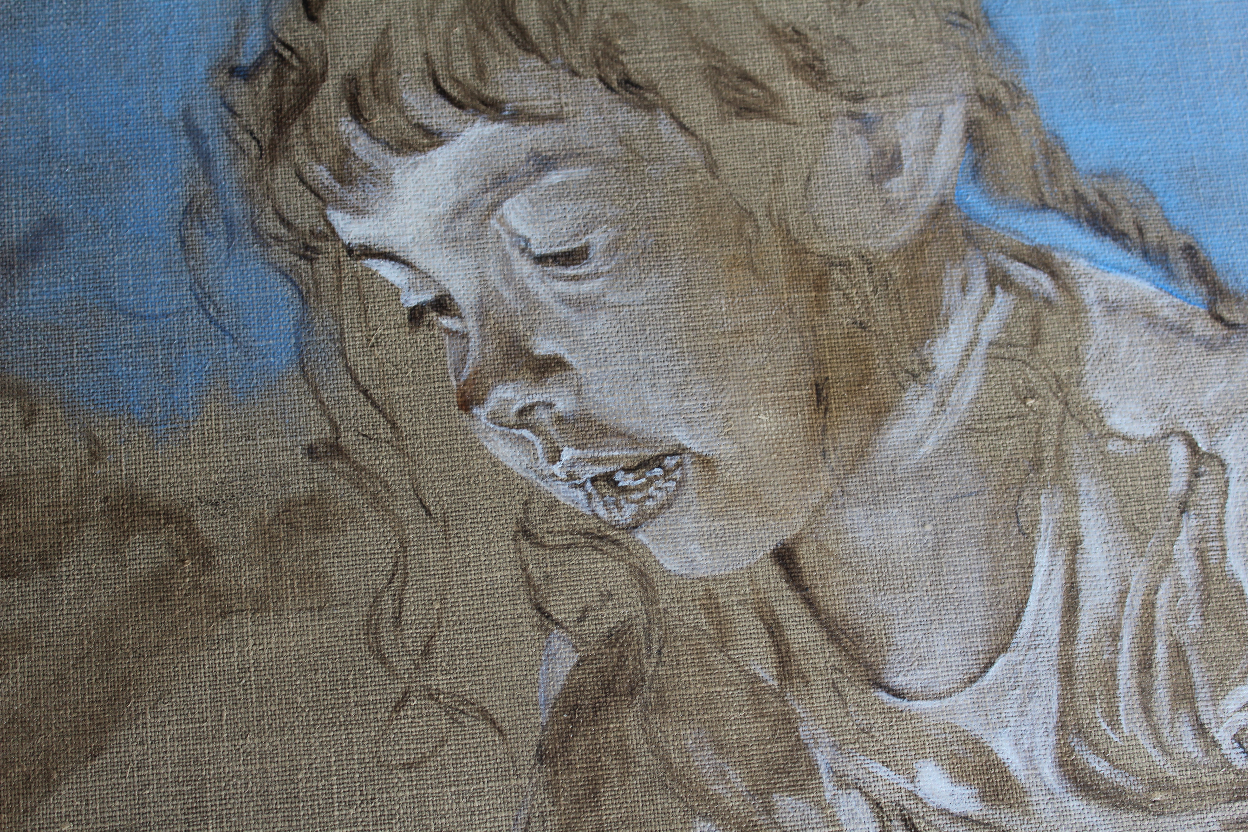
 I am excited about this simple composition. Here you can see my transfer of the drawing to the linen canvas. I used a raw umber on the back of the drawing and placed it carefully to get it positioned just right. I have a natural feel for the center of my paintings and always feel that something is wrong if I don’t get the composition in the right place. Sometimes I have drawn the portrait on paper but then repositioned it differently on the canvas. The photo references, which I took about six years ago, were taken on a brightly lit sunny day. Therefore, not only does the bright sunlight fall behind the child, but the reflected light is very colorful. I must be on guard to get that right. I do not normally use blue as a background color, but it did not seem appropriate to darken the background on a brightly lit day or to wash out the sky with white when there is so much light on the child’s clothing. Since there is such bright light, I decided to establish a lot of those brights first. Normally, I would establish the skin tone in darks and lights before adding color, then move on to the clothing. In this case, I wanted to get all the direct light, which is marked on the arm of the first photo but not shown in the second. What you see in the second photo is direct sunlight falling over the shoulder from the back and going through the clothing, but on the face, that is just reflected light. Even though her face is not lit directly, there needed to be a lot of light in it. We will see how it develops. I have not detailed the background. I hope to suggest the street and trees behind her but keep them muted. Shalom, Diana I decided to add another photo.
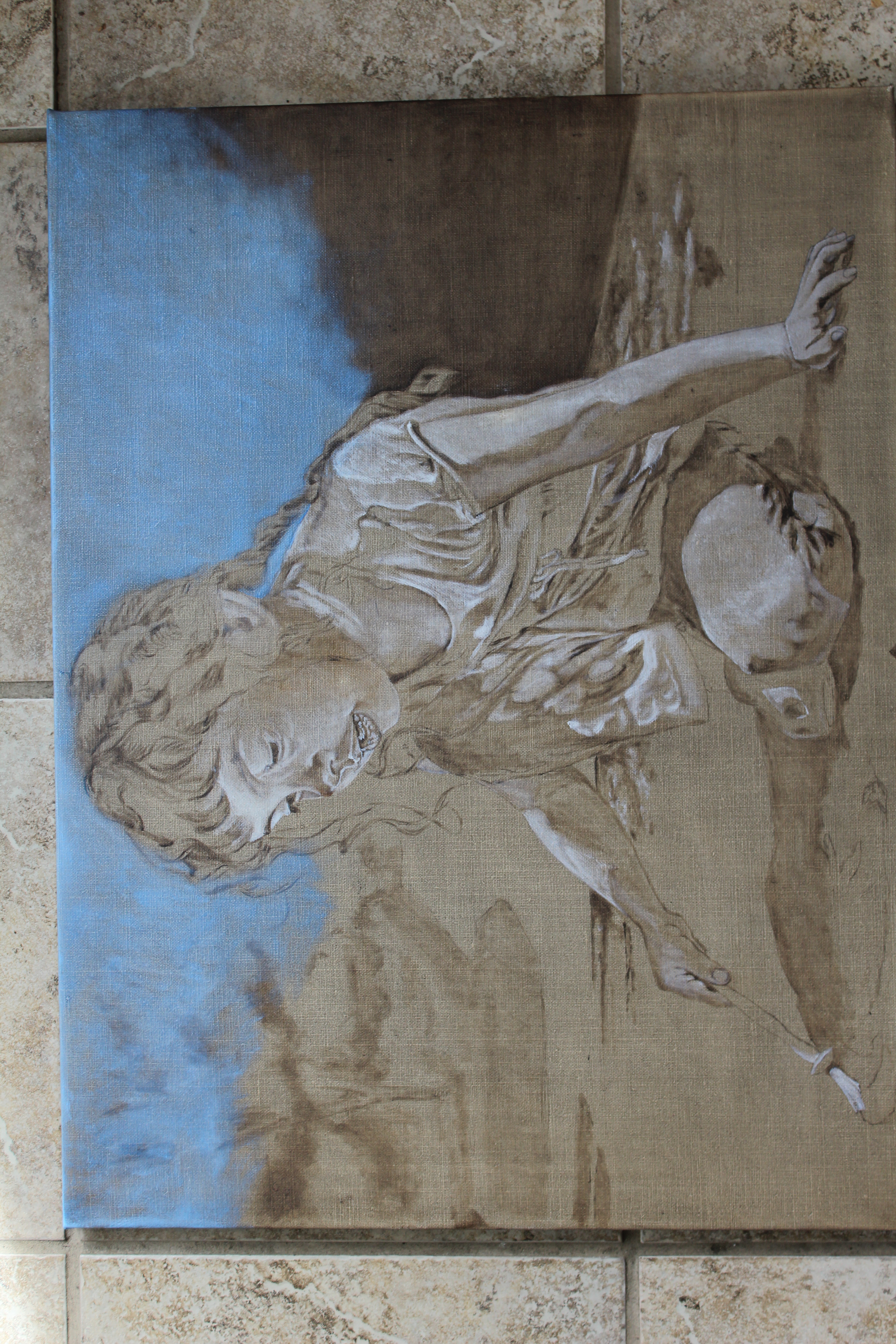 Sorry, I didn’t realize I had not turned it. But you can see all the lights here.
